I looked at 100 ads for menstrual products spanning 100 years — shame and secrecy prevailed
- Written by Dr Jane Connory, Lecturer in Communication Design, Swinburne University of Technology
I analysed 100 magazine advertisements for menstrual products published between 1920 and 2020 to see how they have contributed to feelings of shame and secrecy around women’s periods. I found the period taboo has been promoted by advertisers in Australian woman’s magazines for much of the past 100 years.
Periods are a healthy sign your body’s reproductive system is ready to procreate. Yet “pad ads” from 1920 until the 1940’s played on the idea that period products were a treatment for a medical problem. Rather than a natural occurrence, menstruation was framed as an illness.
For decades, ads also shied away from depicting blood or even mentioning menstruation. Indeed, among the ads I looked at, it wasn’t until 1974 that the word “period” was actually used. Menstruation was variously described as “nature’s handicap” (for instance, in a 1932 pad ad) and the source of “accidents”.
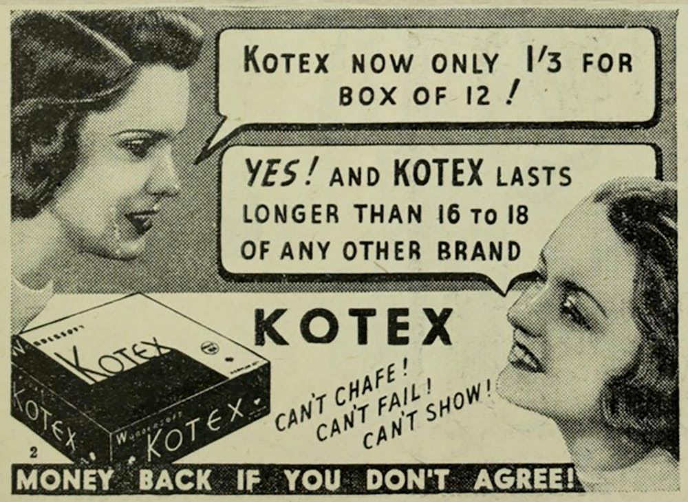 Period secrecy was often modelled around conversations between young women, as in this ad from the Australian Women’s Mirror, 1939.
Newspapers Collection, State Library Victoria.
Period secrecy was often modelled around conversations between young women, as in this ad from the Australian Women’s Mirror, 1939.
Newspapers Collection, State Library Victoria.
Read more: Explainer: why do women menstruate?
A brief history
Johnson & Johnson filed the first patent for a “sanitary napkin” in Australia on December 11, 1929. The application, now catalogued online, contains a simple drawing of cardboard fibres wrapped in crepe paper and gauze.
Before this time, Australian women often used home-made solutions such as reusable rags and throwaway bandages. If they could afford to, they bought local, mass produced brands such as Kleinert, Southall’s and Denyer Brothers, which sold “dainty wears”, “protective necessities”, “surgical appliances” and “hygienic towels”.
The first Australian patents for tampons appeared as early as 1908; the next in 1925. Fourteen patents for tampons were listed between 1940 to 1950. The first appearance of a tampon ad I came across, for Meds, was published shortly after.
Brands like Meds gave the impression their names were short for “medical” or “medicine”. Some packaging adopted symbols such as the cross used to denote hospitals and, of course, the Red Cross.
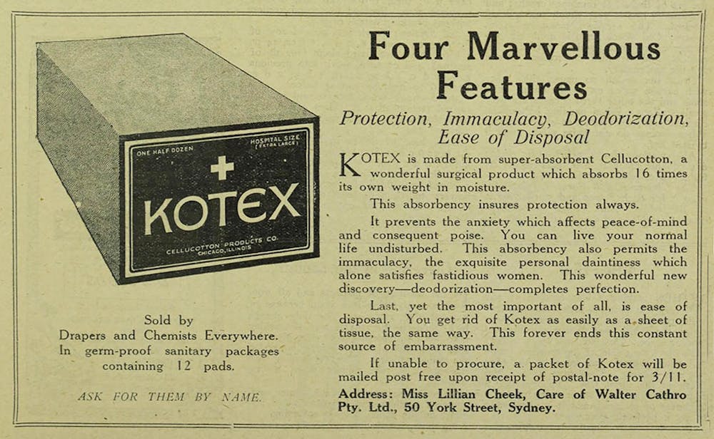 This 1926 Kotex ad from The Bulletin, shows a cross on the packaging and describes the pad as a ‘surgical product’.
Newspapers Collection, State Library Victoria.
This 1926 Kotex ad from The Bulletin, shows a cross on the packaging and describes the pad as a ‘surgical product’.
Newspapers Collection, State Library Victoria.
During the second world war, Australia had to tighten its belt to support the war effort. Brands like Johnston & Johnston concentrated their resources on producing surgical supplies for the armed forces, leaving pads in short supply. One of their ads was apologetic in tone: “We trust you will bear with us, should you … find that your chemist or store has no stocks of … Modess Sanitary Napkins.”
Johnston & Johnston were clear most of their 800 strong workforce was “filling the demands of the Australian Forces” — thus positioning the general well-being of many women as inferior to the war effort. By going without these basic necessities, women were sacrificing for the war. To speak up and demand otherwise would have been seen as unsupportive of the brave men on the front lines.
After the war, certain ads continued to use nurses and scientists to promote menstrual products: from a Meds tampon ad in a 1953 edition of the Australian Women’s Mirror to a Carefree tampon ad in the Australian Women’s Weekly in 1982.
Fortifying the taboo
By censoring images of period blood, pad ads established it as taboo — an embarrassing and “unhygienic” problem. Instead of red, there was a lot of blue in these ads until the 1970s: from the fashions worn by models to ocean waves used as backdrops.
Read more: The ongoing taboo of menstruation in Australia
Even as recently as the 1980’s, scientific diagrams showing how to insert tampons were blue. A Sure & Natural ad from 1983 compared the inefficient absorbency of a conventional pad with the quick dispersion of liquid in a “Maxishield” using royal blue liquids. Further graphics demonstrating layers of absorbency in pads used blue arrows and blue ink to demonstrate their effectiveness.
White also commonly featured in pad ads — a colour symbolising purity and an idealised feminine state for women. In 1973, a brand called Dr White’s appeared. Its ads featured young women dressed in white bikinis, white pant suits, white lingerie or white dresses.
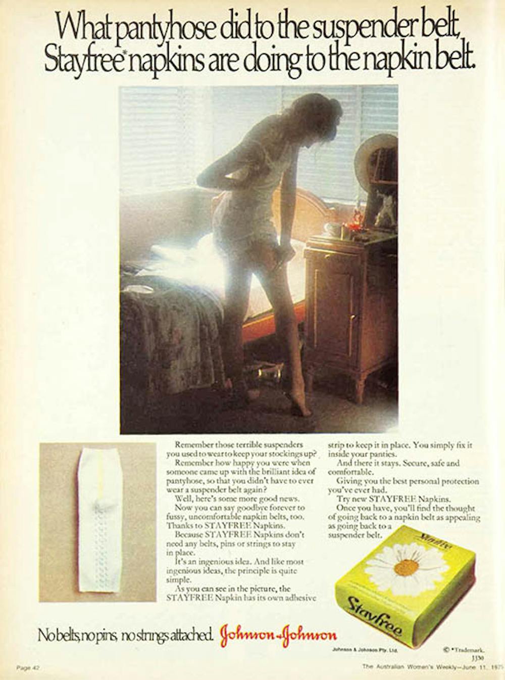 Women were commonly dressed in white as shown in this 1975 Stayfree ad from the Australian Women’s Weekly.
Author’s own photograph.
Women were commonly dressed in white as shown in this 1975 Stayfree ad from the Australian Women’s Weekly.
Author’s own photograph.
Academic Ira Torresi has described the “moral imperative of cleanliness” historically required of women — an imperative reflected in the persistent use of the colour white in these ads. Periods were often viewed as dirty, thus the description of pads and tampons as “sanitary”.
Private spaces like bedrooms and bathrooms featured heavily in pad ads, indicating a need to keep periods out of the public eye.
High fashion drove many campaigns — reinforcing the need for women to constantly be on show. Women in these ads were depicted in low paid careers that typically involved caring — teacher (1944), secretary (1980), air hostess (1983) or mother (1994). Ironically the names of many brands (Carefree, Stayfree) promoted notions of freedom.
Even during the 1970 and 1980’s, sexist and over sexualised images of young women were used to sell period products. One Tampax ad featured a prepubescent girl in a barely there bikini top more appropriate for an adult.
 This double-page spread from a 1983 edition of the Australian Women’s Weekly sexualises a prepubescent girl to sell tampons.
Author’s own photograph.
This double-page spread from a 1983 edition of the Australian Women’s Weekly sexualises a prepubescent girl to sell tampons.
Author’s own photograph.
Research has shown such sexualisation and objectification causes society to view women as “less capable and less intelligent”. Rather than empowering women, this image and others I found, set unrealistic expectations as to how a menstruating girl should look and feel.
Read more: Sexualised girls are seen as less intelligent and less worthy of help than their peers
Modelling secrecy
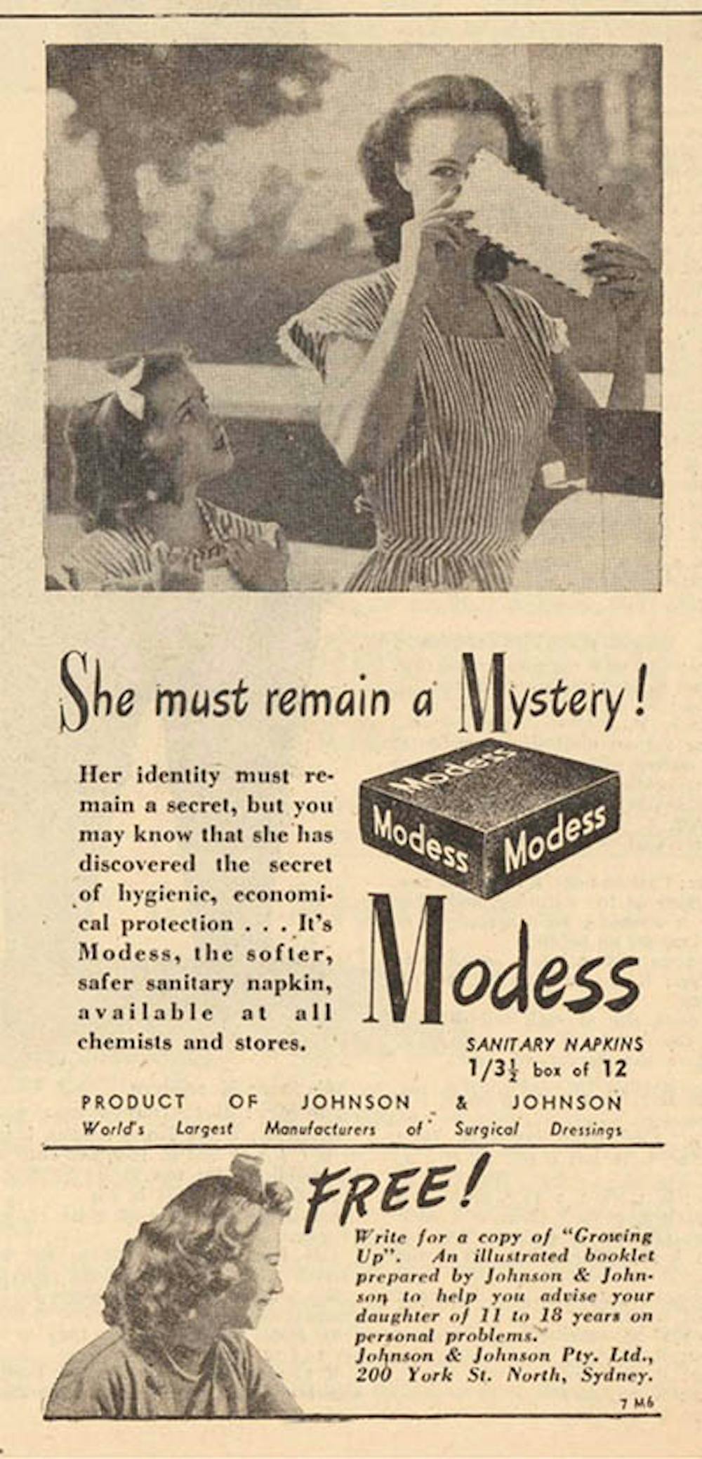 The idea of secrecy is shown in both the image and text of this 1946 Modess ad from The Australian Women’s Mirror.
Newspapers Collection, State Library Victoria.
The idea of secrecy is shown in both the image and text of this 1946 Modess ad from The Australian Women’s Mirror.
Newspapers Collection, State Library Victoria.
Ads in my survey also propagated the idea periods should be talked about in secret — and mostly woman to woman. Teenagers gossiping in private spaces were pictured in ads from 1939 to 1995.
In 2019, however, the Victorian Woman’s Trust published a book drawing on intensive research, which found women want to be more open about their periods. It showed that talking about periods publicly could help end taboos around menstruation, encouraging informed conversations in schools and workplaces.
If women were pictured with men in any of the pad ads I examined, secrecy was pertinent to the image. Men in social settings were always shown to be happily oblivious to menstruating women, as were boys in school settings.
One ad promotes a brand called Whisper — a clear nod to secretive behaviour.
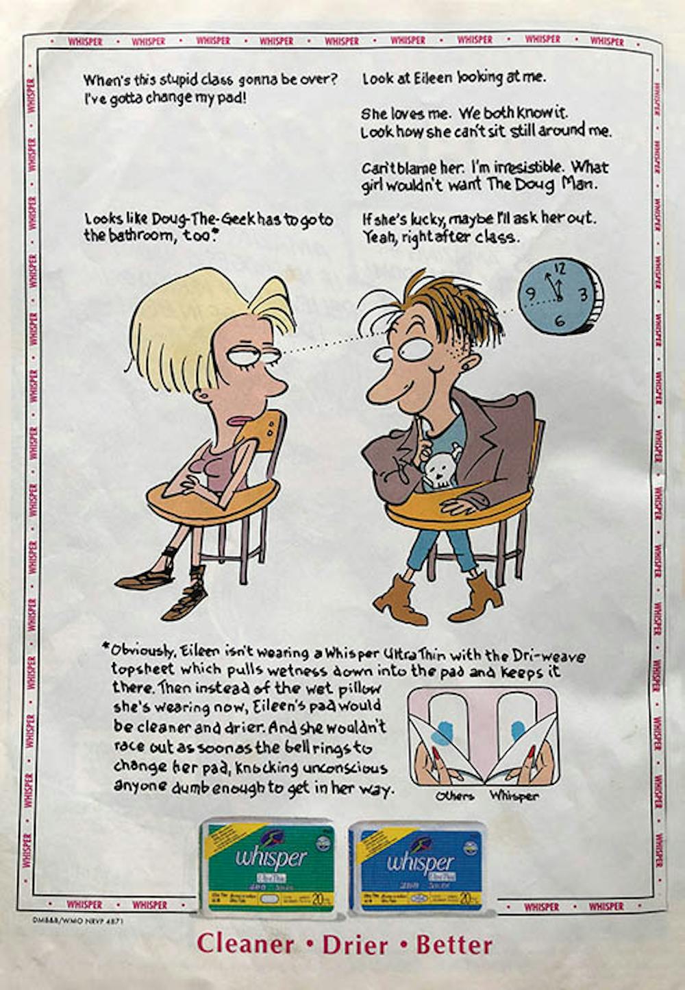 This Dolly ad from 1994 shows how secrecy is also modelled between young women and men.
Author’s own photograph.
This Dolly ad from 1994 shows how secrecy is also modelled between young women and men.
Author’s own photograph.
Headlines such as “She must remain a mystery” and “What are you going to say?” also urged mothers to frame discussions around menstruation as private and secretive.
Ads for Kleinet’s, Modess and Kotex from the 1920’s to 1940’s were even accompanied by coupons enabling mothers to send away for booklets containing advice for dealing with this “source of embarrassment”.
“Discrete” and “plain” packaging was often designed to hide the actual function of period products, enhancing the idea they needed to be kept secret. Similarly, floral motifs are still used on packaging, symbolising anything from new beginnings and fresh fragrances to love and femininity. Again, an idealised view of womanhood masks the realities.
More enlightened times
Pad ads have undoubtedly improved over time. A Lunette menstrual cup ad from Girlfriend magazine in 2020, uses the word vagina boldly in the headline. There is no shame associated with touching the product — it is held aloft by fingers sporting dark, red nail polish.
Read more: Does anyone have a pad? TV is finally dismantling the period taboo
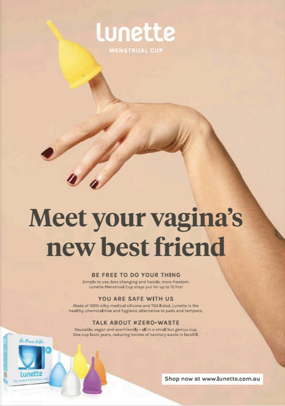 Contemporary period product advertising is not afraid to use the word vagina and the colour red, like this ad from Girlfriend Magazine, 2020.
Author’s own photograph.
Contemporary period product advertising is not afraid to use the word vagina and the colour red, like this ad from Girlfriend Magazine, 2020.
Author’s own photograph.
Similarly a 2019 Cottons ad, also from Girlfriend magazine, features the headline: “Be a natural period pro in no time…” The person in the ad is somewhat androgynous-looking, perhaps as a nod to the diversity of people who experience periods.
However, advertising spaces have changed as magazine circulation has shrunk. Consumer attention is shifting away from glossy pages towards influencers on social media and pop up ads on the internet.
These platforms are now perfectly placed to reject old ideas of secrecy and shame associated with periods, speaking in more honest tones.
Dr Jane Connory has curated an exhibition of pad ads from Australian women’s magazines called Sanitary Secrets. It can be viewed at the BSIDE Gallery (Level 1, 121 Brunswick St, Fitzroy) from Saturday March 27 – Sunday April 5, during Melbourne’s Design Week.
Authors: Dr Jane Connory, Lecturer in Communication Design, Swinburne University of Technology