6 things to ask yourself before you share a bushfire map on social media
- Written by Juan Pablo Guerschman, Senior Research Scientist, CSIRO
In recent days, many worrying bushfire maps have been circulating online, some appearing to suggest all of Australia is burning.
You might have seen this example, decried by some as misleading, prompting this Instagram post by its creator:
As he explained, the image isn’t a NASA photo. What a satellite actually “sees” is quite different.
I’ll explain how we use data collected by satellites to estimate how much of an area is burning, or has already been burnt, and what this information should look like once it’s mapped.
Read more: A crisis of underinsurance threatens to scar rural Australia permanently
Reflective images
When astronauts look out their window in space, this is what they see:
It’s similar to what you might see from an aeroplane window, but higher and covering a wider area.
As you read this, many unmanned satellites are orbiting and photographing Earth. These images are used to monitor fires in real-time. They fall into two categories: reflective and thermal.
Reflective images capture information in the visible range of the electromagnetic spectrum (in other words, what we can see). But they also capture information in wavelengths we can’t see, such as infrared wavelengths.
If we use only the visible wavelengths, we can render the image similar to what we might see with the naked eye from a satellite. We call these “true colour” images.
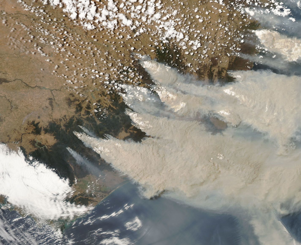 This is a true colour image of south-east Australia, taken on January 4th 2020 from the MODIS instrument on the Aqua satellite. Fire smoke is grey, clouds are white, forests are dark green, brown areas are dryland agricultural areas, and the ocean is blue.
NASA Worldview / https://go.nasa.gov/307pDDX
This is a true colour image of south-east Australia, taken on January 4th 2020 from the MODIS instrument on the Aqua satellite. Fire smoke is grey, clouds are white, forests are dark green, brown areas are dryland agricultural areas, and the ocean is blue.
NASA Worldview / https://go.nasa.gov/307pDDX
Note that the image doesn’t have political boundaries, as these aren’t physical features. To make satellite imagery useful for navigation, we overlay the map with location points.
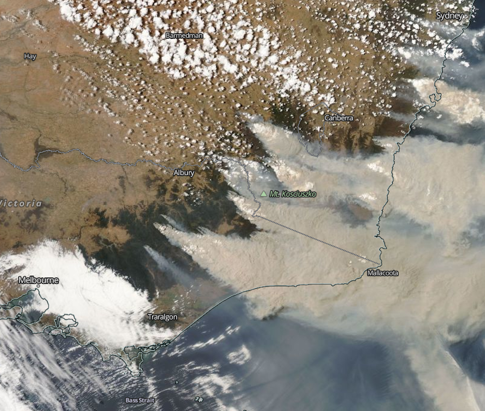 The same image shown as true colour, with the relevant geographical features overlaid.
NASA Worldview / https://go.nasa.gov/2TafEMH
The same image shown as true colour, with the relevant geographical features overlaid.
NASA Worldview / https://go.nasa.gov/2TafEMH
From this, we can predict where the fires are by looking at the smoke. However, the fires themselves are not directly visible.
‘False colour’ images
Shortwave infrared bands are less sensitive to smoke and more sensitive to fire, which means they can tell us where fire is present.
Converting these wavelengths into visible colours produces what we call “false colour” images. For instance:
 The same image, this time shown as false colour. Now, the fire smoke is partially transparent grey while the clouds aren’t. Red shows the active fires and brown shows where bushfires have recently burnt.
NASA Worldview / https://go.nasa.gov/2NhzRfN
The same image, this time shown as false colour. Now, the fire smoke is partially transparent grey while the clouds aren’t. Red shows the active fires and brown shows where bushfires have recently burnt.
NASA Worldview / https://go.nasa.gov/2NhzRfN
In this shortwave infrared image, we start to “see” under the smoke, and can identify active fires. We can also learn more about the areas that are already burnt.
Thermal and hotspots
As their name suggests, thermal images measure how hot or cold everything in the frame is. Active fires are detected as “hotspots” and mapped as points on the surface.
While reflective imagery is only useful when obtained by a satellite during daytime, thermal hotspots can be measured at night – doubling our capacity to observe active fires.
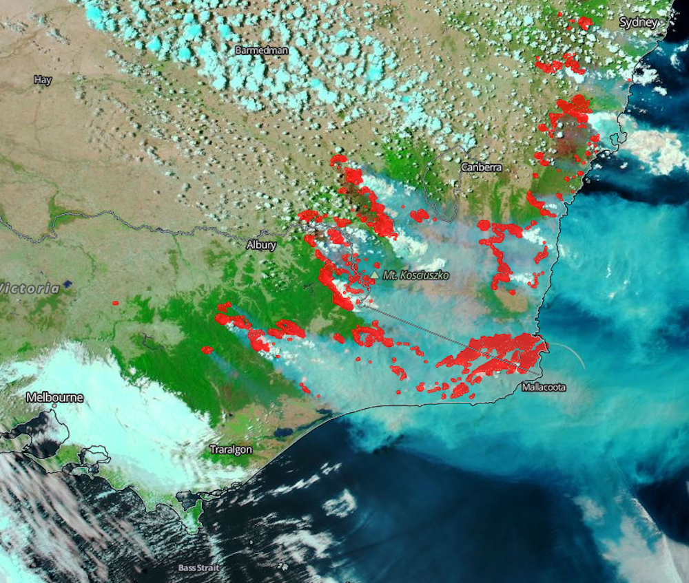 The same image shown as false color, with hotspots overlaid in red.
NASA Worldview / https://go.nasa.gov/2rZNIj9
The same image shown as false color, with hotspots overlaid in red.
NASA Worldview / https://go.nasa.gov/2rZNIj9
This information can be used to create maps showing the aggregation of hotspots over several days, weeks or months.
Geoscience Australia’s Digital Earth hotspots service shows hotspots across the continent in the last 72 hours. It’s worth reading the “about” section to learn the limitations or potential for error in the map.
Read more: Spread the word: the value of local information in disaster response
When hotspots, which show “hot” pixels, are shown as extremely big icons, or are collected over long periods, the results can be deceiving. They can indicate a much larger area to be under fire than what is really burning.
For example, it would be wrong to believe all the areas in red in the map below are burning or have already burnt. It’s also unclear over what period of time the hotspots were aggregated.
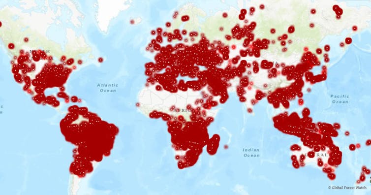 The ‘world map of fire hotspots’ from the Environmental Investigation Agency.
Environmental Investigation Agency / https://eia-international.org/news/watching-the-world-burn-fires-threaten-the-worlds-tropical-forests-and-millions-of-people/
The ‘world map of fire hotspots’ from the Environmental Investigation Agency.
Environmental Investigation Agency / https://eia-international.org/news/watching-the-world-burn-fires-threaten-the-worlds-tropical-forests-and-millions-of-people/
Get smart
Considering all of the above, there are some key questions you can ask to gauge the authenticity of a bushfire map. These are:
• Where does this map come from, and who produced it?• is this a single satellite image, or one using hotspots overlaid on a map? • what are the colours representing? • do I know when this was taken? • if this map depicts hotspots, over what period of time were they collected? A day, a whole year? • is the size of the hotspots representative of the area that is actually burning?
So, the next time you see a bushfire map, think twice before pressing the share button.
Authors: Juan Pablo Guerschman, Senior Research Scientist, CSIRO