
That moving graph of US tax rates that went viral, it's probably wrong. Here's why
- Written by Robert Breunig, Professor of Economics and Director, Tax and Transfer Policy Institute, Crawford School of Public Policy, Australian National University
Over the past month a huge political dispute has sprung up in the US about the fairness of its tax system. It is fuelling debates between Democratic presidential rivals, and it is raising questions about the fairness of tax systems everywhere, including in Australia.
It began with a New York Times article entitled The Rich Really Do Pay Lower Taxes Than You.
It was accompanied by one of the most evocative graphics you are likely to see:
Here’s what the graphic shows.
The vertical axis is total tax (US federal, state and local) as a proportion of income. The horizontal axis is income band, from lowest to highest.
At first the yellow line displays the graph for 1950 which is sloping upwards, showing that the highest earners paid the highest proportion of their income in tax (70%) and the low earners the lowest (less than 20%).
It shows what is known as a “progressive” tax system, in which those with the highest income sacrifice the greatest proportion of their income.
Read more: So you want to tax the rich – here's which candidate's plan makes the most sense
Hit “play” on the graphic, and the yellow line gets less progressive over time until 2018 when it becomes pretty flat, except for the few very rich Americans at the very top of the income distribution who pay less of their income in tax than everyone else.
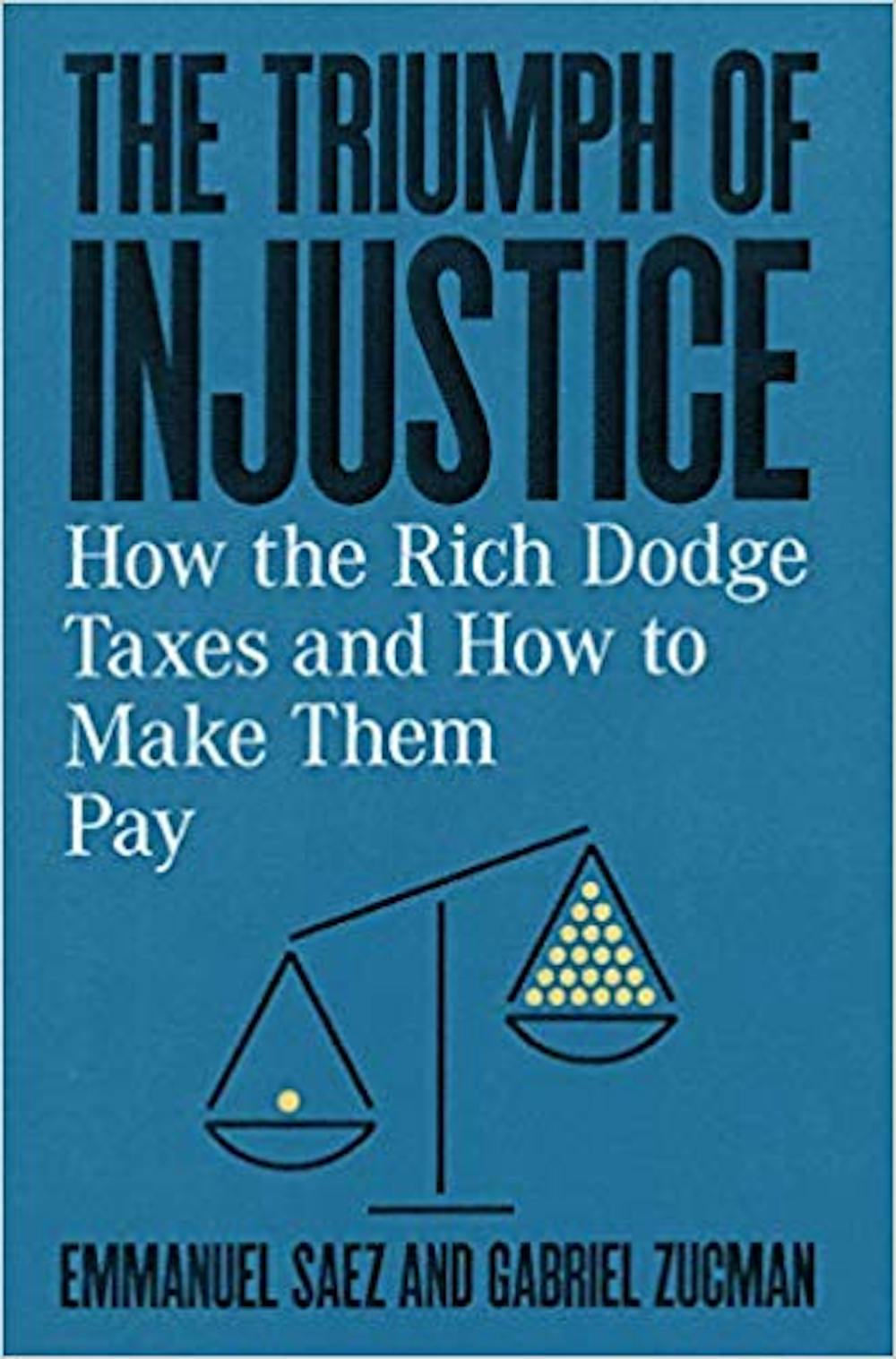 The Triumph of Injustice, by Emmanuel Saez and Gabriel Zucman.
W.W. Norton
The Triumph of Injustice, by Emmanuel Saez and Gabriel Zucman.
W.W. Norton
The graph is derived from a new book by economics professors Emmanuel Saez and Gabriel Zucman entitled The Triumph of Injustice: How the Rich Dodge Taxes and How to Make them Pay.
Their claim that the US has sleepwalked away from progressive taxation is compelling partly because it is so different from the conventional wisdom.
Warren Buffet might pay less tax than his Secretary, but the traditional story is that the US tax system is progressive, along the lines of Australia’s.
That’s been the view of the US Treasury, the US Congressional Budget Office, and the US Tax Policy Centre.
It’s also the finding of the Organisation for Economic Co-operation and Development and a peer-reviewed 2018 Quarterly Journal of Economics article by Saez and Zucman themselves.
It depends on what you think is income
Heavyweights such as Nobel Prize winner Paul Krugman and former US treasury secretary Larry Summers have chimed in, taking opposing positions pn #econtwitter about the veracity of the graph.
More helpfully, David Splinter from the US Joint Committee on Taxation points out that Saez and Zucman’s measure of income differs from the traditional measure in two significant respects:
It assumes that underreported, untaxed income goes primarily to high-income earners. This under-reporting occurs when US taxpayers report less income than they earn, or claim more deductions, exemptions or tax credits than they are entitled to (a large and underappreciated issue. That explains much of the apparent low rate of tax on income at the top end.
It excludes from its definition of income government payments other than social insurance payments and deducts payroll taxes. Given that government payments are directed more to those at the bottom end than the top, this has the effect of pushing down apparent income at the bottom and pushing up the apparent tax rate.
The impact of the first is that if a top earner gets, say, $10 million of taxable income and pays $6 million of it in tax, but is assumed to earn an extra $3 million in untaxed income and $1 million in untaxed retirement income, that person’s implied overall tax rate falls from 60% to 43%.
Read more: What did the rich man say to the poor man? Why spatial inequality in Australia is no joke
The impact of the second can be illustrated by this thought experiment: imagine increasing the marginal tax rate of those earning more than $1 million to as much as 100%, and then returning all the tax to them via a government payment.
Saez and Zucman’s method would treat this as a genuine tax rate of 100% for high earners and find that the system had become extraordinarily progressive, even though no-one’s cash position would have changed.
Without these peculiarities of measurement, calculations by Wojciech Kapczuk of Columbia University suggest that the tax system has remained pretty progressive, retaining its upward sloping graph.
Kapczuk and other economists have also questioned the imprecision of some of the data, particularly the guesses needed to calculate the tax paid by the top 400 taxpayers since 1950, and the latest data, which was incomplete when the book was published.
Harvard University’s Larry Summers and Greg Mankiw demolished Saez in a rather unforgiving fashion during a debate at a recent Peterson Institute workshop on combatting Inequality.
It might damage the cause of research
To their credit, Saez and Zucman have welcomed scrutiny and released a partial working paper responding to critiques and a Q&A dealing with some of the issues on the book’s website.
The graph has alarmed many people, and by being released in a popular book during the US primaries has had a more immediate impact than it would have had it been subject to the slower and more painful academic process designed to establish the truth.
The credibility of Saez and Zucman’s work hangs in the balance. Should it ultimately be discredited, trust in economic research more generally will suffer. We will all lose.
Authors: Robert Breunig, Professor of Economics and Director, Tax and Transfer Policy Institute, Crawford School of Public Policy, Australian National University